SA Bits
Short, evidence-based notes that connect human cognitive research to practical dashboard design.
Each card includes a clear takeaway you can apply immediately.
⏱️ Alarm Duration Affects Perceived Validity
SA Bit: Longer-lasting alarms are perceived as more valid, and people are more likely to respond to them.
Design takeaway: When displaying an alarm, consider showing how long it has been active.
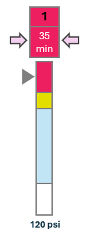
Why it matters: Duration adds context. It helps users distinguish a brief blip from a persistent condition worth acting on.
Reference: Endsley & Jones
❓ Missing Information Is Not Neutral
SA Bit: When information is missing, people often assume it agrees with the information that is present.
Design takeaway: Explicitly identify missing data rather than leaving gaps that users may interpret as normal or consistent with the rest of the display.
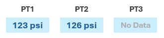
Why it matters: Missing information is often interpreted as agreement with the information that is available. Research by Bolstad and Endsley found that when one of three sensors was missing, participants tended to assume its value matched the other two sensors, even though the missing sensor could have been reporting a conflicting condition.
Reference: Bolstad & Endsley (1999a); Endsley & Jones
🎯 Visual Salience Can Communicate Certainty
SA Bit: Information presented with greater visual salience tends to be perceived as more certain. Darker saturation, lower transparency, and denser object fills can intuitively communicate higher certainty.
Design takeaway: When information has varying levels of certainty, consider varying its visual salience accordingly—make more certain information visually stronger and less certain information visually weaker.
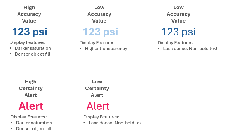
Why it matters: Not all displayed information is equally reliable. Encoding certainty visually can help users distinguish information they can place greater confidence in without requiring them to interpret an additional numeric probability or confidence value.
Reference: Endsley & Jones, Principle 11: Use Data Salience in Support of Certainty