Supports Perception & Comprehension
Note: “Information Timeliness” represents one form of data uncertainty.
At a later stage, this concept will be merged into a new Uncertainty Representation SA Concept, to provide a more integrated description of information reliability.
Why It Matters
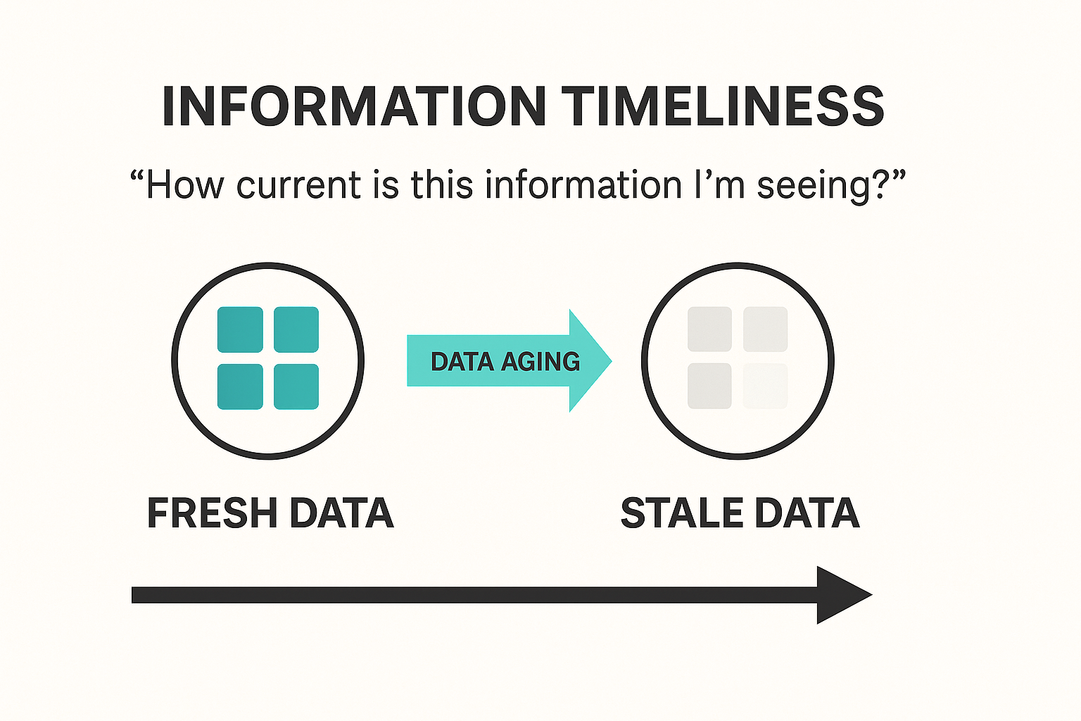
- In dynamic industrial environments, older data becomes less trustworthy as time passes.
- Operators may not naturally notice missing updates if stale data looks the same as fresh data.
- Subtle time-based visual cues prevent silent degradation of the operator's Situation Awareness.
Operational Impact Examples
- Missed update in compressor station status: If a compressor stops and the symbol appears normal, operators may fail to act before pressure rises to unsafe levels.
- Sensor disconnection during a chemical batch process: Outdated temperature data could give a false impression that a reaction is on track, risking off-spec product or safety issues.
- Outdated flowmeter reading in water treatment: Operators might assume flow is continuous when it’s not, delaying detection of a blockage or pump failure.
Visualizing data aging directly contributes to timely human intervention — a core requirement in process safety and product quality.
Cross-Domain Analogy
Radar Displays: In air traffic control, aircraft symbols often dim gradually if no radar sweep refreshes the aircraft’s position, providing an immediate visual cue of data aging.

Typical Design Techniques
- Fading Opacity: Visual elements gradually fade as data ages.
- Desaturation: Colors shift toward grayscale with time since last update.
- Countdown timers: Textual or graphical age indicators.
- Halo decay: Glows or edge highlights diminish as time passes.
- Last updated timestamp: Display of data freshness (less effective for fast visual scan).
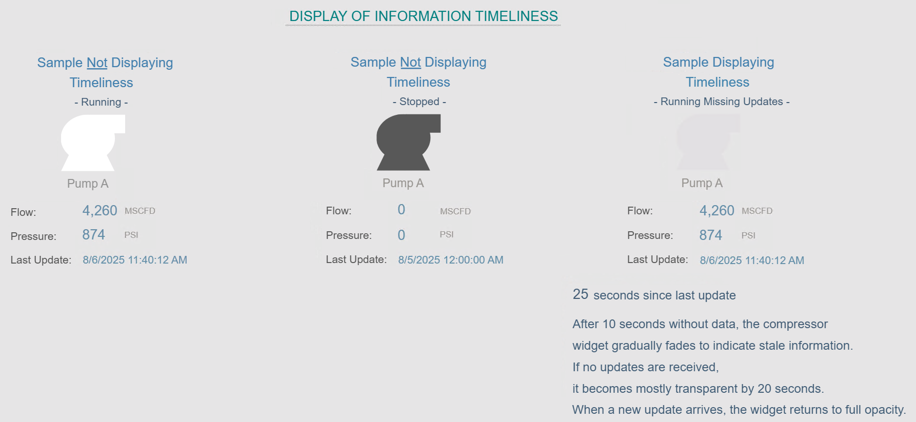
Use Case for Demonstration in Platform
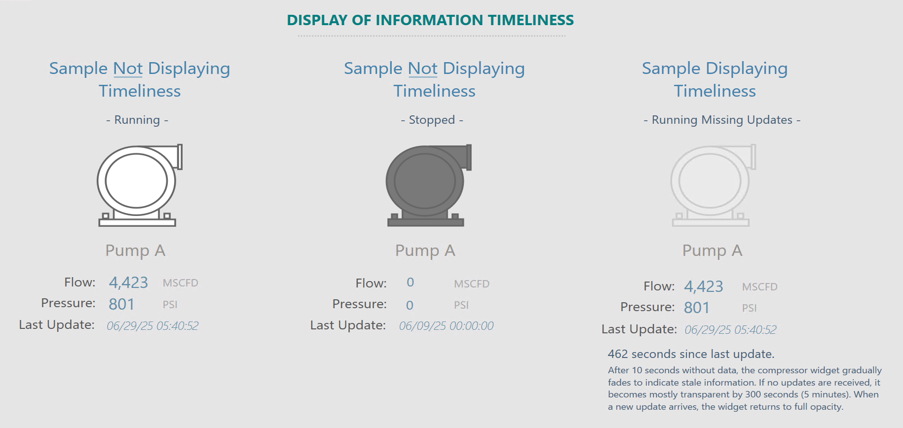
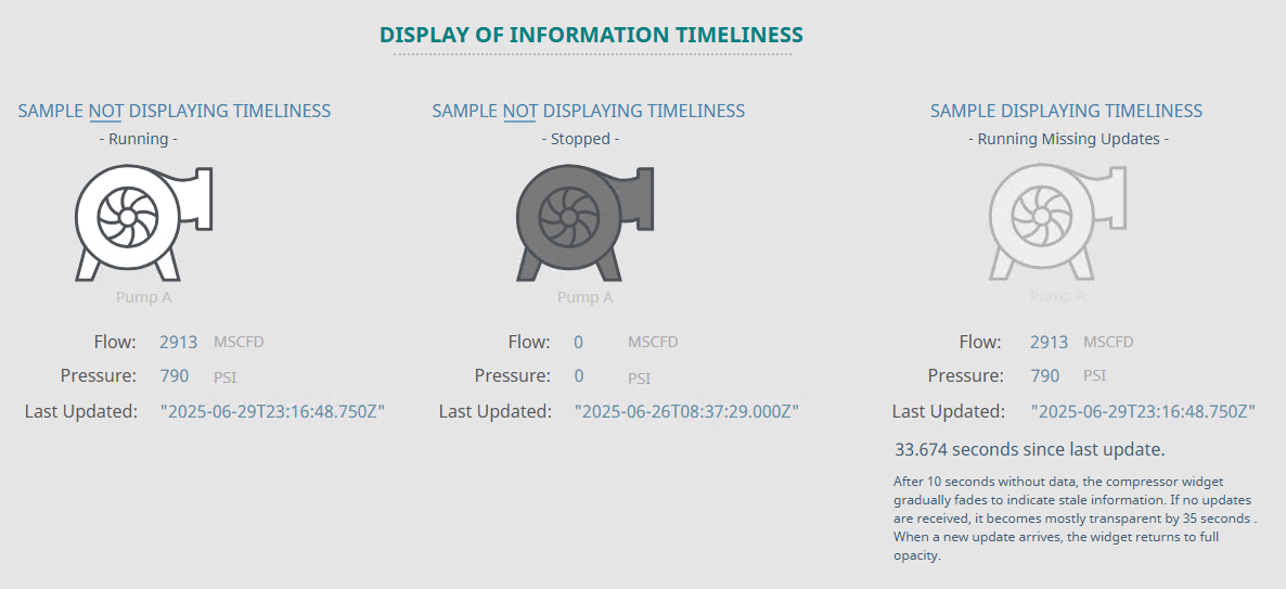
Consider a pipeline network monitoring dashboard where equipment symbols fade if no update has been received in 5 minutes:
- A compressor station icon maintains full color if data is recent.
- If no update arrives after X amount of time, the icon fades toward 80% opacity.
- This immediately signals attention to possible stale or disconnected data.
- Upon receiving a new update, the full opacity is restored automatically.
Platforms Used for Demonstration
✅ FrameworX — Demonstration of Information Timeliness
| Aspect | Notes |
|---|---|
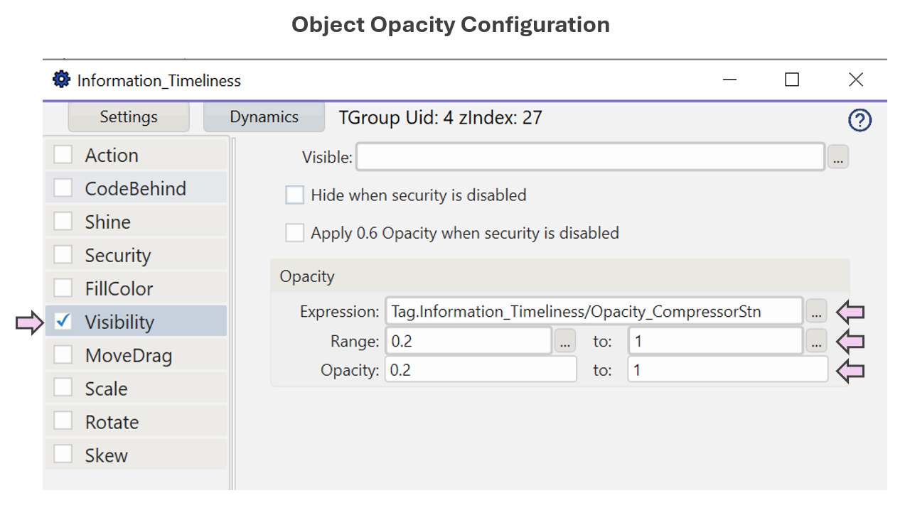
| Implementation Approach | Analytics scripting used for simulating data and calculating a linear fade applied to object opacity. |
| Display Build | • Canvas page type used. • Icon opacity dynamically controlled via analytics tag. |
| Version Used | 10.0.1.464 |
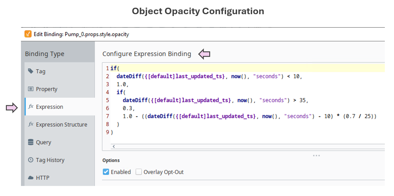
✅ Ignition Perspective — Demonstration of Information Timeliness
| Aspect | Notes |
|---|---|
| Implementation Approach | Analytics scripting used for simulating data and calculating a linear fade applied to object opacity. |
| Display Build | • Dashboard display component used. • An “opacity” property was added, and an “Expression Binding” script configured to dynamically control opacity. |
| Version Used | Ignition 8.1.x (Perspective) |
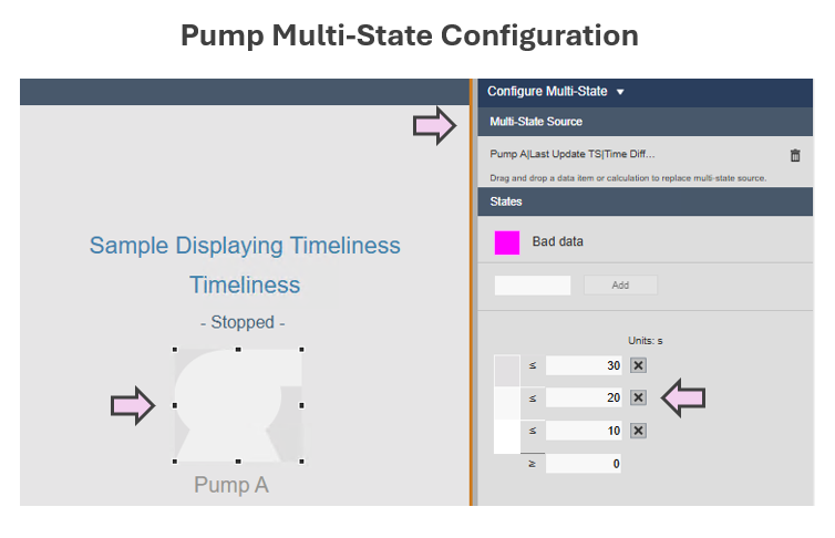
✅ AVEVA PI Vision — Demonstration of Information Timeliness
| Aspect | Notes |
|---|---|
| Implementation Approach | Analytics scripting used for simulating data and calculating the number of seconds since last update (function: SecSinceChange()). |
| Display Build | “Multistate” feature was used to set a color range that emulates opacity fading. |
| Version Used | PI Vision 2024, PI Server 2018 SP3 |
See which platforms have been used to demonstrate each SA concept in the
SA Vendor Listing.