Why It Matters
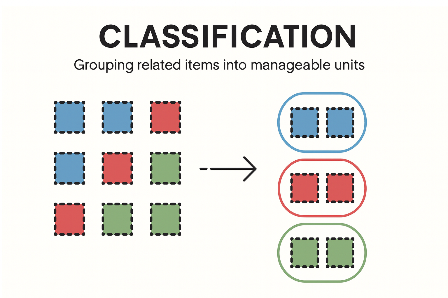
Classification (formerly “Chunking” in this framework) helps users make sense of many data points by grouping them into meaningful categories.
- Operators often face many signals in very little time.
- Without clear categorization, working memory gets overwhelmed.
- Classification improves cognitive efficiency by visually organizing data into recognizable groups.
Operational Impact Examples
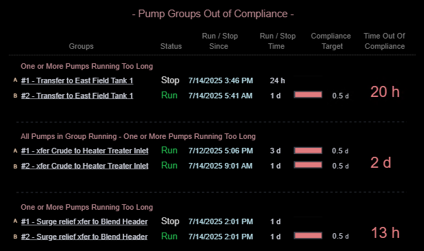
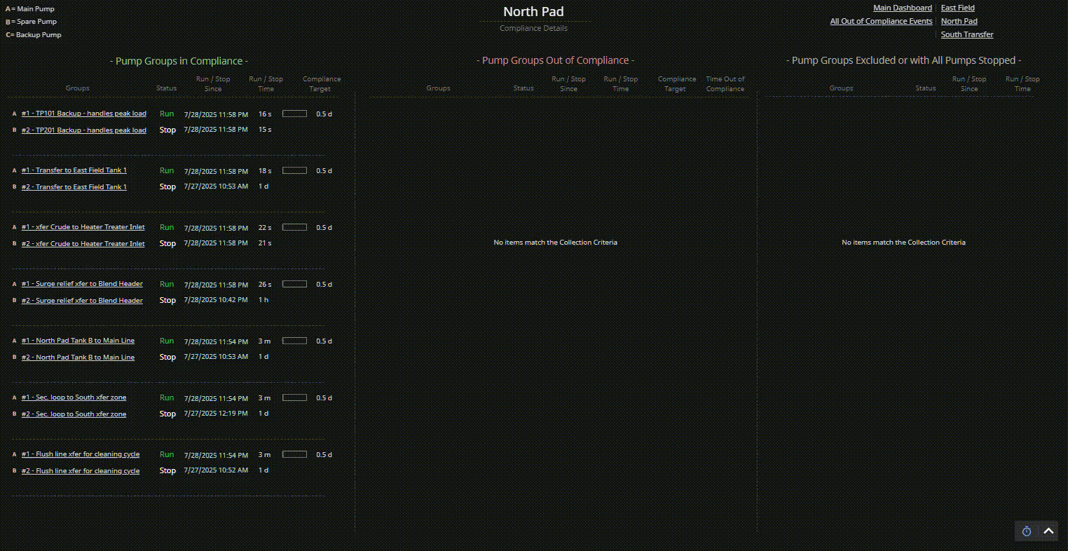
- Reliability meeting dashboards: Categorizing out-of-compliance assets helps teams focus discussion and plan actions quickly.
- Pump monitoring during shift change: Instead of scanning each pump, operators can review categories like “Running Too Long” or “All Stopped” to grasp the situation instantly.
- Alarm review displays: Classifying alarms by source system (instrumentation, electrical) or likely root cause (flow blockage, power loss) speeds analysis and response.
Classification bridges perception and action — enabling users to see what matters without assembling the puzzle mentally.
Cross-Domain Analogy
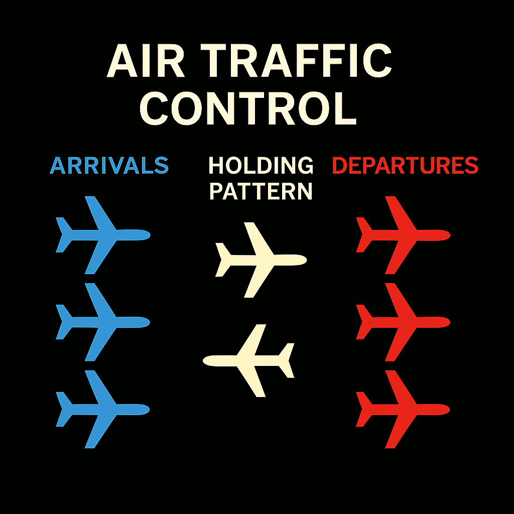
Air Traffic Control: Experienced controllers don’t track 30 individual planes in isolation — they classify them into meaningful sets like “arrivals,” “departures,” or “holding pattern.” This makes complexity manageable and improves decisions.
Typical Design Techniques
- Section headings and labels: Visually separate related items using titles, lines, or padding.
- Color-coded categories: Use consistent colors to bind items conceptually.
- Whitespace and alignment: Leverage layout to form natural group boundaries.
- Spatial repositioning: Move items between categories only when it aids comprehension.
The demonstration in platform section below shows examples of these techniques in practice.
Use Case for Demonstration in Platform
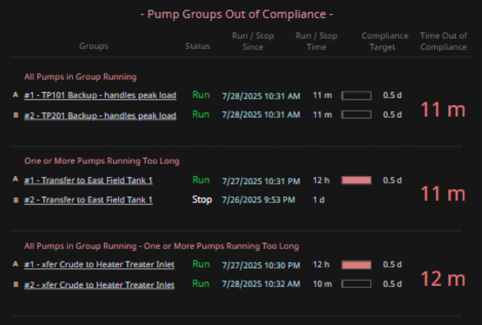
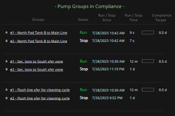
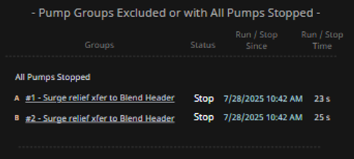
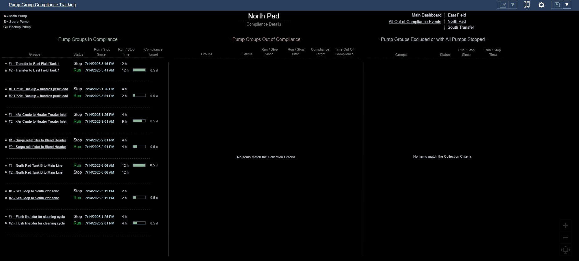
Consider a compliance tracking dashboard for pump groups:
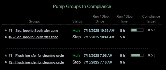
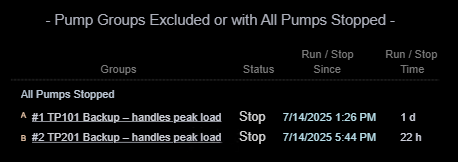
- Visually organize pump groups into three distinct categories: In Compliance, Out of Compliance, and Excluded or Fully Stopped.
- Use spatial layout (e.g., three columns) to create clear visual categories.
- Apply consistent spacing and alignment within each category to reinforce classification.
- Evaluate how easily users can identify which pump groups need attention, rather than mentally scanning all pumps at once — especially during early-morning reliability meetings when cognitive load is high.
Platforms Used for Demonstration
✅ AVEVA PI Vision — Demonstration of Classification
| Aspect | Notes |
|---|---|
| Implementation Approach | Visual categorization handled via analytics-driven tag logic and grouped containers. |
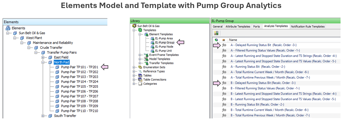
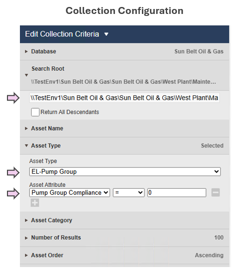
| Display Build | • Utilized Collections to categorize pump groups by compliance status • Timers, timestamps and time accumulations enhance comprehension of compliance state |
| Version Used | PI Vision 2024. PI Server 2018 SP3 |
To view the animation in a larger, more legible format, right-click on the GIF and select "Open Image in New Tab".
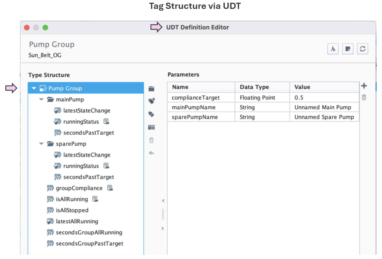
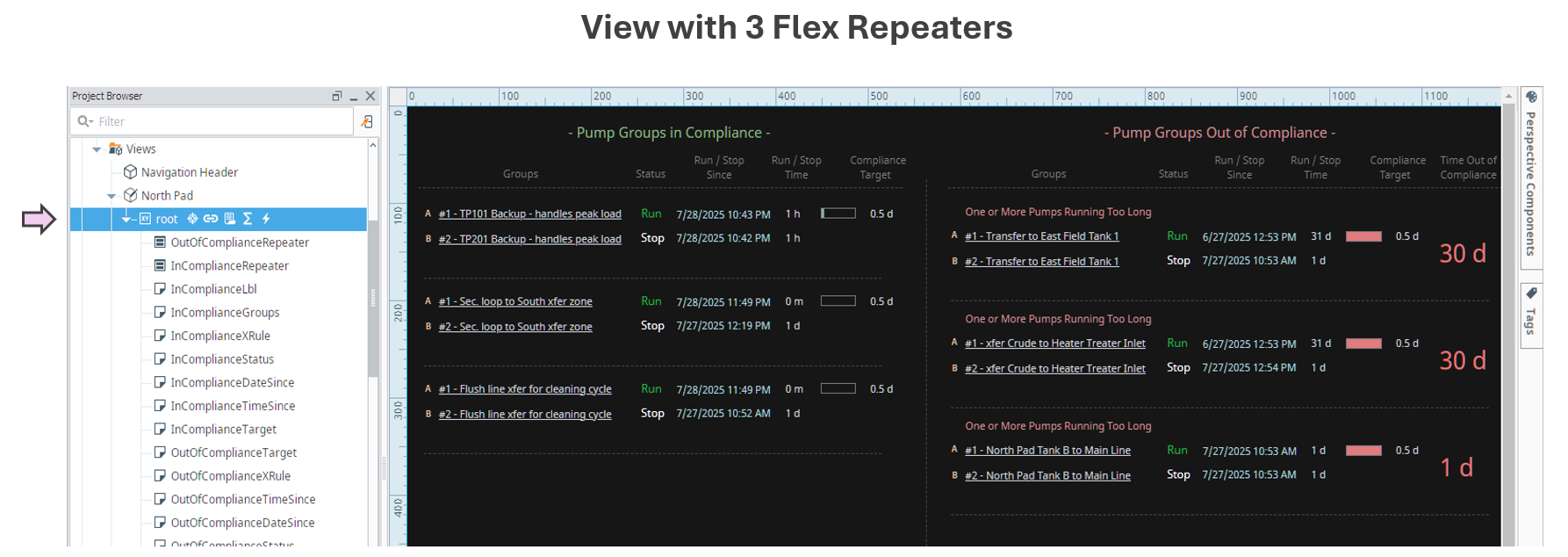
✅ Ignition Perspective — Demonstration of Classification
| Aspect | Notes |
|---|---|
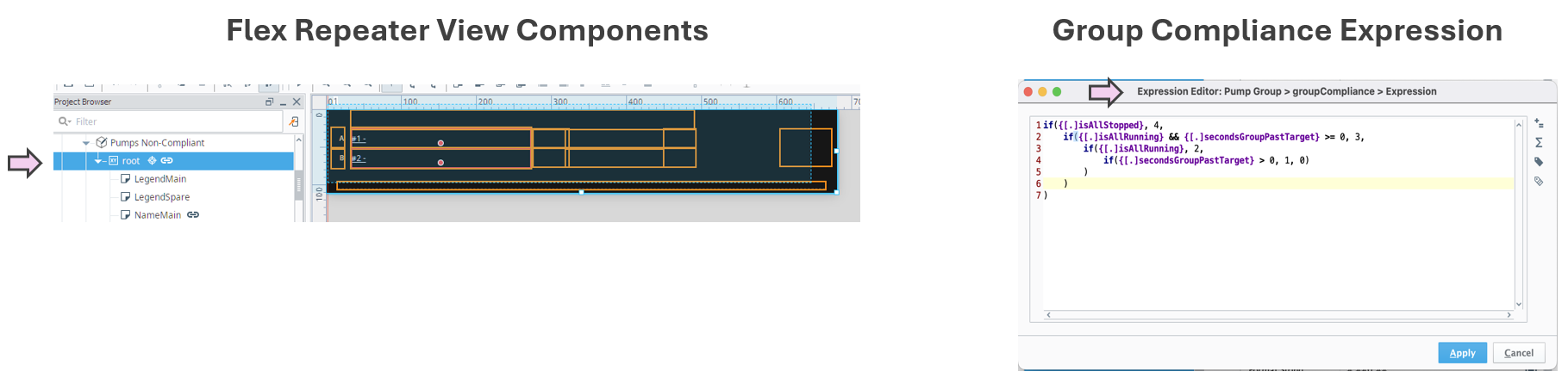
| Implementation Approach | Pump groups are modeled using UDTs and organized dynamically by compliance status. Categorization logic is handled via tag-driven rules and scripting within Flex Repeaters. |
| Display Build | • Three clearly separated columns show compliant, out-of-compliance, and stopped pump groups • Each group contains dynamic runtime counters, timestamps, and compliance indicators • Layout supports at-a-glance comparison and comprehension |
| Version Used | Ignition 8.1.x (Perspective) |
To view the animation in a larger, more legible format, right-click on the GIF and select "Open Image in New Tab".